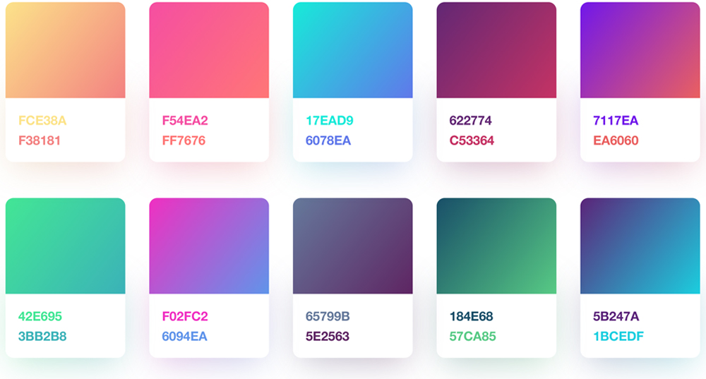

From the soft gradients of 2015 that brought about a sense of depth, to the all-out exotic and saturated hues seen in 2017, gradients are now set to become a more natural element of design.
Hailed as ‘Gradient 2.0’ within the Behance community, gradients seem to be here to stay. Unlike previous years, gradients will not just dominate the foreground; they will be incorporated into all aspects of design, including backgrounds, typography, image overlays, illustrations, logos, icons and more.
Many big name brands, including Instagram, Spotify and Skype, have already embraced the gradient trend of 2018 to make bold statements and add more depth and dimension to their brands. By creatively using gradients, these brands have been able to create something that feels new, yet looks unique, modern and refreshing, to keep their brand fresh and relevant.
As you can see, gradients are a simple, yet effective tool in creating eye-catching, memorable designs, particularly when executed well. To achieve the perfect gradient, we’ve compiled a list of best practices.
Don’t overdo it
The best way to create an appealing gradient is to keep it simple. Most gradients are created using two colours, so try using no more than three colours.
Avoid conflicting colours
Use a colour wheel to find the perfect analogous, monochromatic, triad, complementary, compound or shade colours for your gradient.
Always decide on a light source
This will help determine where the lighter and darker areas will appear in the gradient.
Add a gradient that suits your shape
For square or polygonal areas, it is best to apply a linear gradient. For more rounded areas, radial gradients are better suited.
Always have separate shapes for the fill colour and gradient colour
This will allow you to apply a gradient over an existing colour and experiment with different opacity to create different effects.


